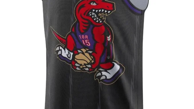
Ranking and Roasting the leaked NBA City Edition Jerseys
On Tuesday, the 2024-25 NBA City Edition jerseys were leaked, and… people have opinions. If you’re new here, every season each team gets to design a new “city edition” jersey, and the design is supposed to celebrate the city and culture of each market. It’s digressed a little over the years, and some of them are just… bad.
Maybe it’s because these design meetings are likely run by some boring white guys with no drip. Maybe it’s because fashion and design have unfortunately become simplistic and all together boring. Who know, but I’m bored.With the 30th anniversary of the Raptors franchise coming up, and Vince Carter’s Hall of Fame induction/eventual jersey retirement (???) — Toronto decided to bring back the dino. Excellent choice.
Here is the leaked Raptors city edition jersey (without the player number, hence the blank space):The Raptor is doing the Vince Carter dunk, wearing a Vince Carter jersey. It’s kinda obvious the direction this is going, and it’s awesome. While I personally would have loved a bit more nod to the OG white/purple jerseys, there is a lot to like about this. The black/pinstripes and gold accents nod to the more recent city editions. The lack of “Toronto” branding is actually cool, and brings more focus to Carter, which I think is meant to put more focus on him. I hope they do the number in that classic “Raptor” font that the OG numbers were in.
For reference, here are the rest of the leaked designs:I’ll keep it short — this is one of the worst jerseys I’ve ever seen in my life. It looks like someone made it in a word doc. I won’t even associate Canva with this because it’s so bad. I’ve never been so bored looking at a jersey. The colour does not even match the Celtics usual branding, because this colour more closely resembles Mountain Dew or a green highlighter. I have second hand embarrassment for the city of Boston right now. You win a chip and THIS is your big follow up? Terrible.
Be the first to comment